The stretched buttons problem in IE
As you might know, web forms have to by styled with care, since their native look often is the best you can achieve.
That said, sometimes even default look has its bugs. A truly flagrant mistake concerns buttons in Internet Explorer (including version 7) in Windows XP. If the button's caption is too long, the browser produces such a nasty thing:
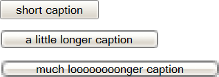
This is a combination of two bugs:
- the buttons are unnecessarily too wide
- large buttons are rendered jagged and weird
The second bug is not likely to be fixed. That's an error in the rendering kernel of the browser, and all you can do is to report it to the developers and hope that they'll do something about it in the future. Maybe…
It's interesting that the wider the button, the uglier the rendering. So by solving the first problem, i.e. by forcing Internet Explorer to narrow the buttons to their correct width, we should be able to reduce or even eliminate the jagged-rendering effect. Let's see.
Narrowing the button
My attempts to set different values for width or
padding didn't work. In such a moment, the webdesigner usually
tends to fly blind and experiment with CSS properties like display,
overflow, position, etc. The result was that setting
overflow: visible does what we want. Since the button confines the
text tightly in this case, adding the padding property is
recommended.
input.button {
	padding: 0 .3em;
	overflow: visible;
}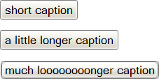
Now you can see that narrowing the button eliminated the rendering problem for the second case, and reduced it for the third one.
I was able to enjoy the sensation of victory over the digital enemy exactly until the moment when I formatted the form containing the wide button into a table. Voila:
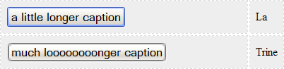
Although the buttons are displayed with their correct width, they take up
space originally reserved for their. The problem can be solved by setting
width: 0. But superior browsers (Opera, Firefox) do indeed respect
the zero width, so that we are forced to use the IE-only hack. And
that's already a well-known story. Either we use the improved “underscore
hack”, i.e. =width:0 (for IE7 it's necessary to replace the
underscore with the e.g. equals sign), or to separate the stylesheet for IE
using conditional comments.
I spent some time googling other solutions. Jehiah Czebotar went through the same battle as I did and with the help of his readers he found a very similar result, yet with an extra elegant workaround.
Here is the solution:
/* IE stretched button bug workaround */

input.button {
	padding: 0 .25em;
	width: 0; /* for IE only */
	overflow: visible;
}

input.button[class] { /* IE ignores [class] */
	width: auto;
}
The trick lies in differentiating out the “better browsers” from IE7 using a valid way. Then we don't need the CSS “equal sign hack” or an extra stylesheet file. You can then use the code for all the browsers. Enjoy!
Comments
Ebo #1
oni asi nepočítali ,že někdo bude tak “trhlej” a bude dávat popisek na tlačítko třeba " Tohle je tlačítko, které tě přivede do extáze" .. ale ta krpa v tom vykreslování je teda drsná …
pan_Vzducholoď #2
do you speak english? :)lol
Ivo Pavlik #3
It looks like they render it correctly up to certain size only and for larger buttons they only scale up the largest allowed image :-/
This article has been closed. It is no longer possible to add comments.